ShopDreamUp AI ArtDreamUp
Deviation Actions
PLATINUM VIP
47 Subscribers
If you want to see more excting and hot pictures of men‘s bodies, please just join the PLATINUM VIP.
$8/month


Suggested Deviants


Suggested Collections


You Might Like…


Comments2
Join the community to add your comment. Already a deviant? Log In
Good overall composition. I'm going to agree with <img class="avatar" src="a.deviantart.net/avatars/t/i/t…" alt="
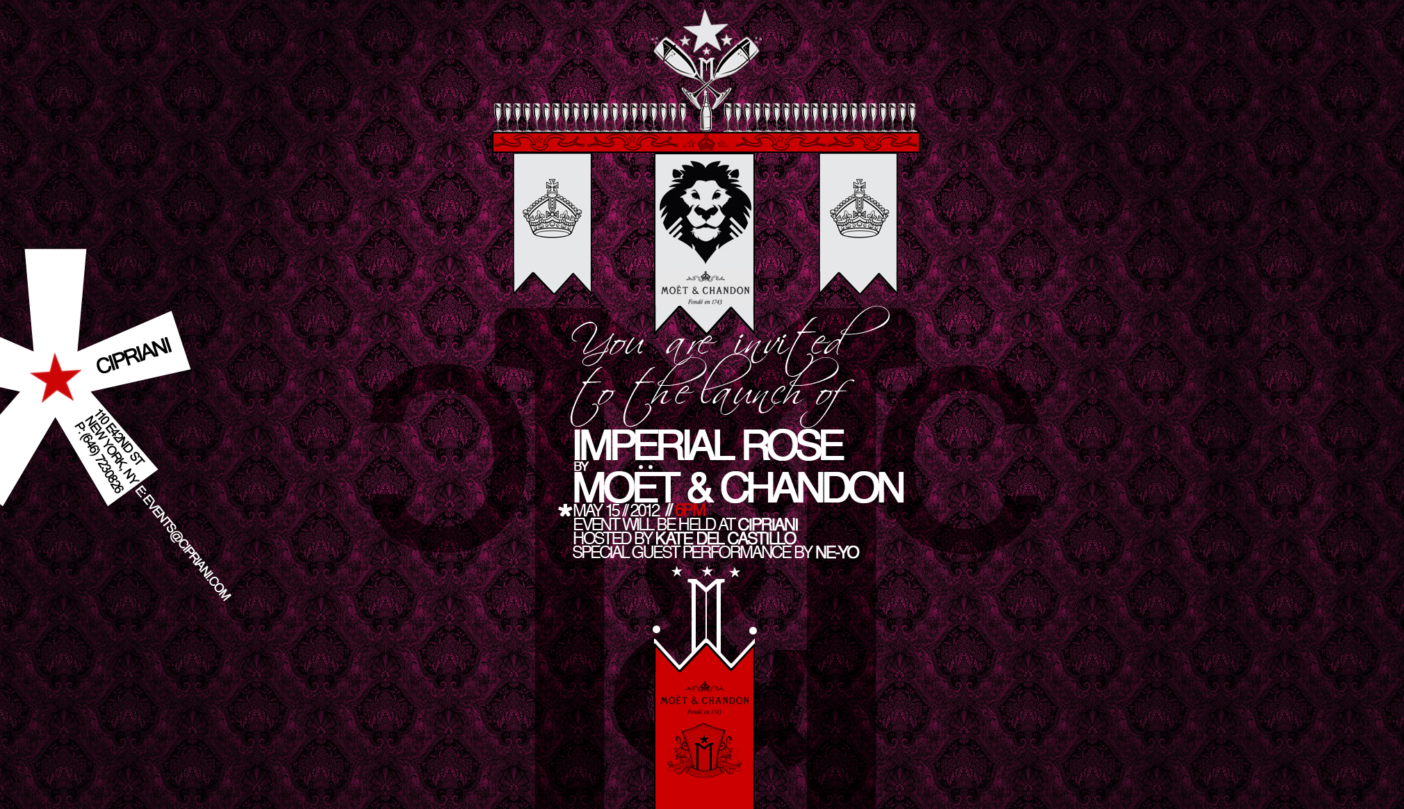
 " title="Timepest"/>'s previous post - the "royal" colors do work very well together here, with the modernized quality of flat reds contrasting fluently against the softer purple background pattern. I'm glad a third color wasn't added, as the choice to stick with white text+banners assures that all the pertinent information pops out at the viewer without any complication
Your unique use of the offset asterisk as an informative graphic is quite eye-catching, and serves to break up the otherwise perfectly uniform horizontal weight of the invitation nicely.
As with much of the other design work I've seen from you, you've done a wonderful job of presenting a sum of information that both serves it's core purpose of delivering specific details, while at the same time drawing the eye with an exquisite, highly pristine grade of aesthetics. I feel as though I'm being invited to a modern, red carpet event here.
The only element that is drawing my eye away from the text in a slightly awkward way may be the bold black lion on the central banner. Hypothetically saying that the lion graphic is a legitimate logo (as in you must use it), I might suggest reworking it into a line-art representation (or perhaps merely scaling it down a bit?), so as to better match it with the crowns at either of it's sides.
With the greatest amount of width, and thus weight placed at the top of this invitation, breaking your otherwise consistent use of line-art throughout the rest of the presentation's graphics tends to drag my eye away from some of the smaller scale text.
My humble critique has been offered. Fantastic job overall Anton. Thou art skilled sir!